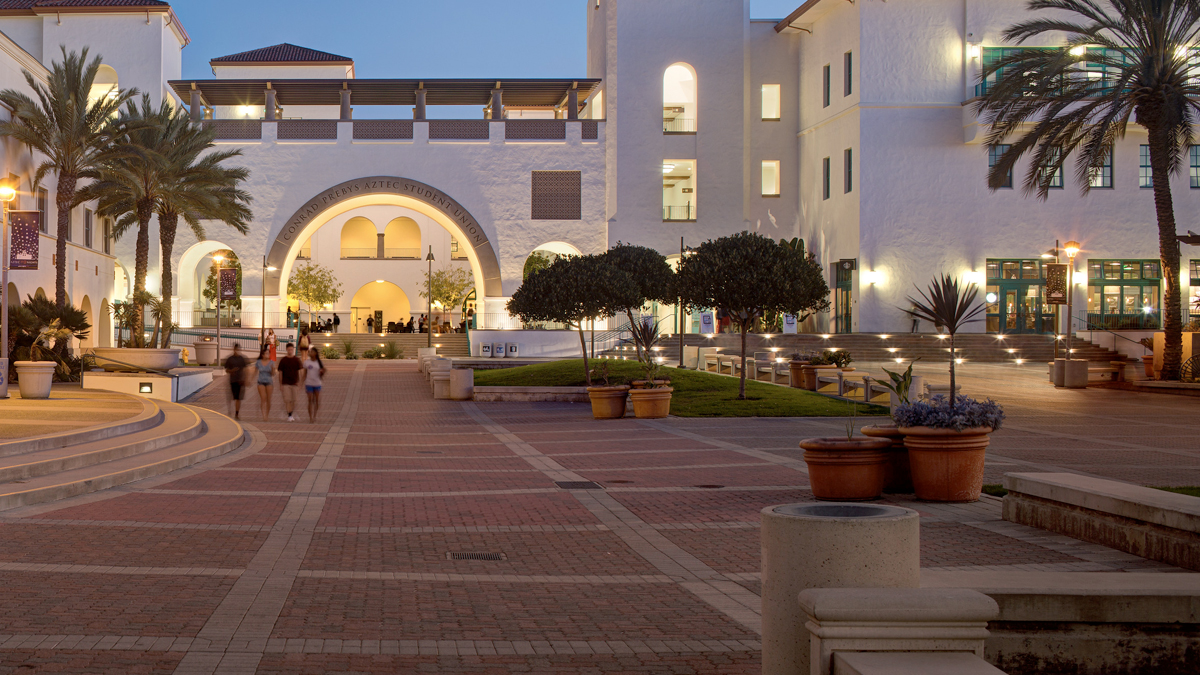
Patterns and Shapes
Custom patterns and shapes are inspired by the distinctive architectural details and motifs on campus. By abstracting these forms, they become a dynamic graphic element that can represent vibrancy, inclusivity, transcendence and transformation.
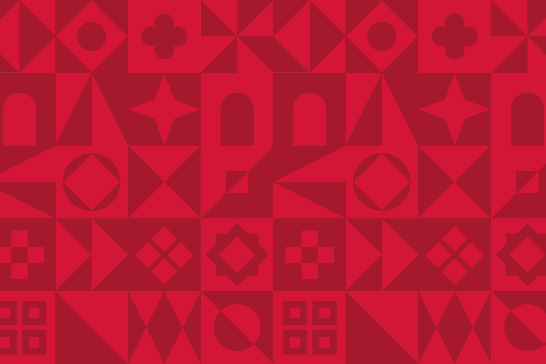
Patterns
Patterns may be used at large and small sizes. The consistent square shape allows for maximum flexibility. Combine different shapes to create a mosaic effect, or repeat for a sense of symmetry and pattern. Only use dual color shades for a pattern (bright red and dark red or bright teal and dark teal); do not combine different hues on one layout.
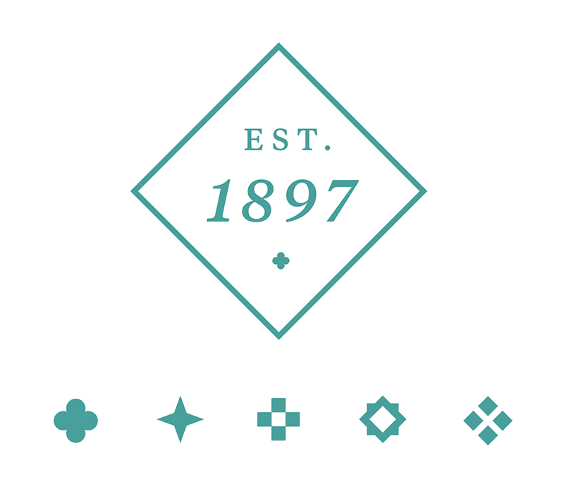
Shapes
The callout box and custom text ornaments are also inspired by the architecture and tile work. They reflect our identity in a beautiful and distinctive way.
Use custom shapes sparingly and with ample space, they should act as a compliment to your main message.
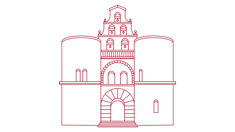
Illustrations
The line illustration of Hepner Hall is a modern interpretation of SDSU’s iconic building on campus. This illustration works best in uncluttered designs with a solid background.

Custom Type
Our visual system includes custom word art based on our primary logo. These hero words should be used graphically to create a focal point or a running texture. They may utilize any of the brand colors. Please note the custom type is reserved for special use cases.

Icons
SDSU has a suite of flat-style icons available for coherent and consistent communication. Icons can quickly and clearly convey a visual message.
Proper Usage
For inquiries on the proper usage for special design elements including the custom type please contact [email protected].

