Social Media Logos
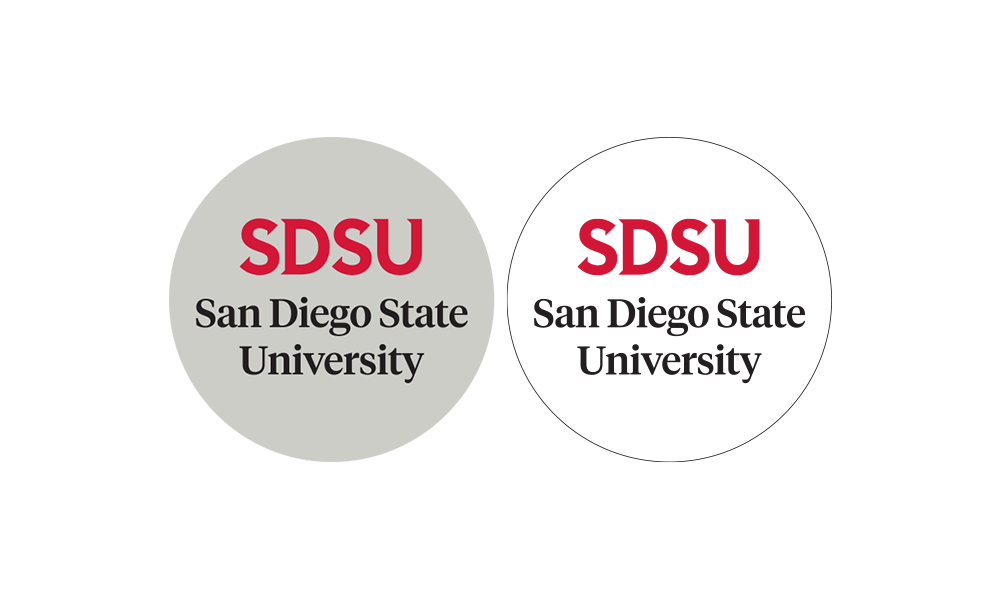
Due to the limited space and shape of social profile images, there is a unique logo template to communicate the SDSU brand effectively and consistently across social media accounts. This logo will be used for social media purposes only; it cannot be used for other channels.
Design
To use space efficiently, design modifications include centering the unit name, reducing the white space around SDSU and removal of the line separating SDSU and the unit name. When there is an acronym in the unit name, the line will stay in the logo.
Color Variations
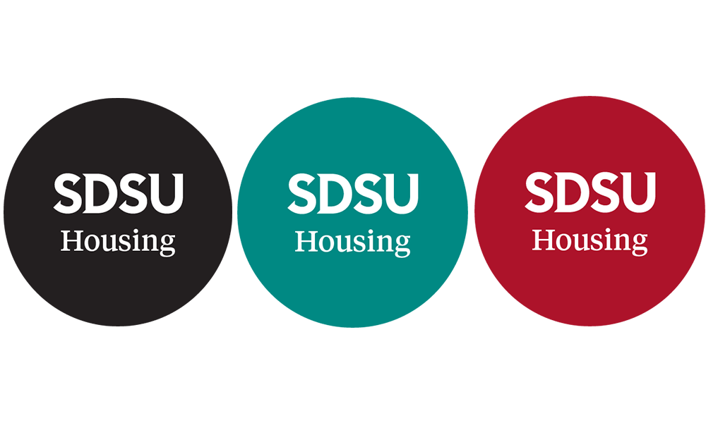
There is flexibility with logo color variations and backgrounds. A solid background is recommended for legibility and accessibility reasons although there is the option of using SDSU’s official patterned backgrounds. The below section outlines the approved color variations.

Full Color Logo
When a full color logo is used without the line separator, the background can be either light gray or white. If the full color logo does have a gray line separator, the background should be white.

One-color Logo
The white one-color logo can be used with SDSU brand colors including black, charcoal, bright red, dark red and bright teal or dark teal. The black one-color logo can be used with a white or light gray background. Find more information regarding accessibility in the Color Palette: Contrast section of the SDSU Brand Guidelines.

Unit Names
If the department, college or unit name needs to be shortened for legibility and/or to fit into the allotted space, it must be shortened to a term that is intuitive and would not be confused with other units on campus. Acronyms are also acceptable if they are commonplace for the unit. Logos need to be kept at Level 1, without the addition of a College or Division for legibility purposes.
Please email [email protected] for additional support, guidance and questions.

